Better with every move.
The merger of two global mobility leaders marks a fresh start – for our combined business and our people. For our customers and our partners. For all our stakeholders, in fact. And more than that, it represents an opportunity we’re determined to seize: to meet their different needs and expectations in the world of today (and tomorrow), better than ever before.
Embracing change.
That’s why we’ve created a new brand identity: to unite and inspire us all, as we embark on this exciting next leg of our journey towards the future of mobility – and towards becoming the leading global sustainable mobility player.
But don’t worry: some things never change. Whether you’re a customer, partner or investor, you can always count on our full suite of world-leading mobility services, our innovative collaboration approach and our drive to continuously reimagine the road ahead. Just think of our rebrand as us upgrading to the shiniest new specs.

Allow us to (re)introduce ourselves.
Hi, we’re Ayvens. With its roots in the words ‘way’, ‘advance’ and ‘heaven’, our new name evokes an elevated mobility experience.
Through its letters, sounds and rhythm, Ayvens conveys the confidence of a leader. The dynamism of an innovative business. And the fluidity of our smart and flexible offering.
Our promise.
To make life flow better.
Our mission.
To deliver better mobility – more seamless, more accessible, more sustainable – for everyday life.
Our vision.
That each day is an opportunity to move better, and we all have a role to play.
Our ambition.
To become the leading global sustainable mobility player.
Our personality.
Is supportive, inspiring, authentic and optimistic.
What we do.
Why and how we do it.

Our personality.
Our new identity is also reflected in our new look, which perfectly captures our spirit and personality. The Ayvens brand symbol is drawn from the letter ‘a’, representing our name. Its two components represent the coming together of our two legacy companies. And its fluid upward form represents the forward momentum and dynamism of our business.
The Ayvens name and symbol are part of a logo that reinforces our backing by our globally renowned parent organisation, Societe Generale group. And our vibrant, unique colours – sustainable turquoise, liberty white, optimistic yellow and serene blue – are inspired by the natural world around us.

Better with every move.
Our tagline is simple but packed with meaning. Ultimately, it’s our new brand proposition in a nutshell, reinforcing our commitment to being better with every move.

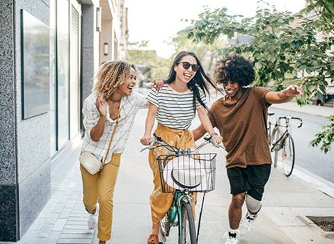
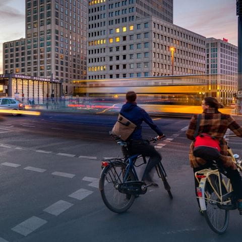
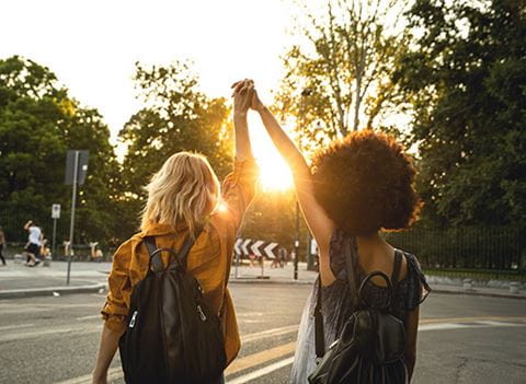
Our first ad campaign
A step towards better mobility
Each step we take contributes to a giant leap forwards
Our first advertising campaign for Ayvens embodies our core belief: every step we take, no matter how small, contributes to a giant leap forward. When preparing and filming our campaign, it was never just about capturing beautiful scenes; it was about embodying Ayvens' brand tagline of being "Better with every move."
The campaign demonstrates our commitment to offering seamless, sustainable mobility solutions, while showcasing our collaboration with various partners, highlighting diverse perspectives and expertise. As a leading provider of sustainable mobility solutions, we want to help people take a step in the right direction. This campaign reinforces our mission to make life flow better for more people, in more places than ever before.
With each step we take together, we move closer to a sustainable future in mobility. Every small step we make leads us towards a giant leap towards better.
.jpg?iar=0&rev=435f1a511dba4b61a6c960c1fc3435d6&mw=480&io=transform%3Afill%2Cwidth%3A480)